|
Socoder -> Question of the Day -> QOTD : Cheap design tricks |
|
| Sun, 28 Feb 2010, 09:58 | |
|
Jayenkai |
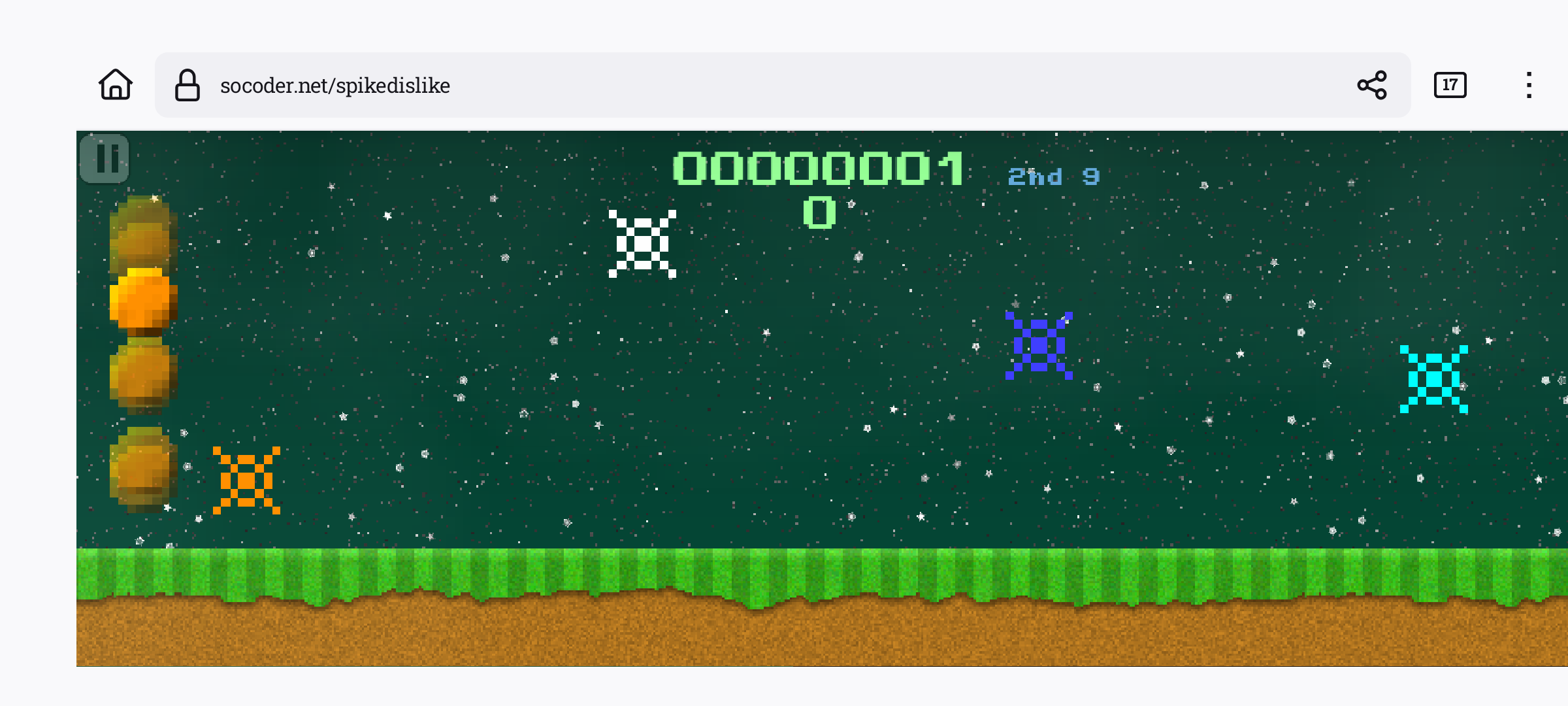
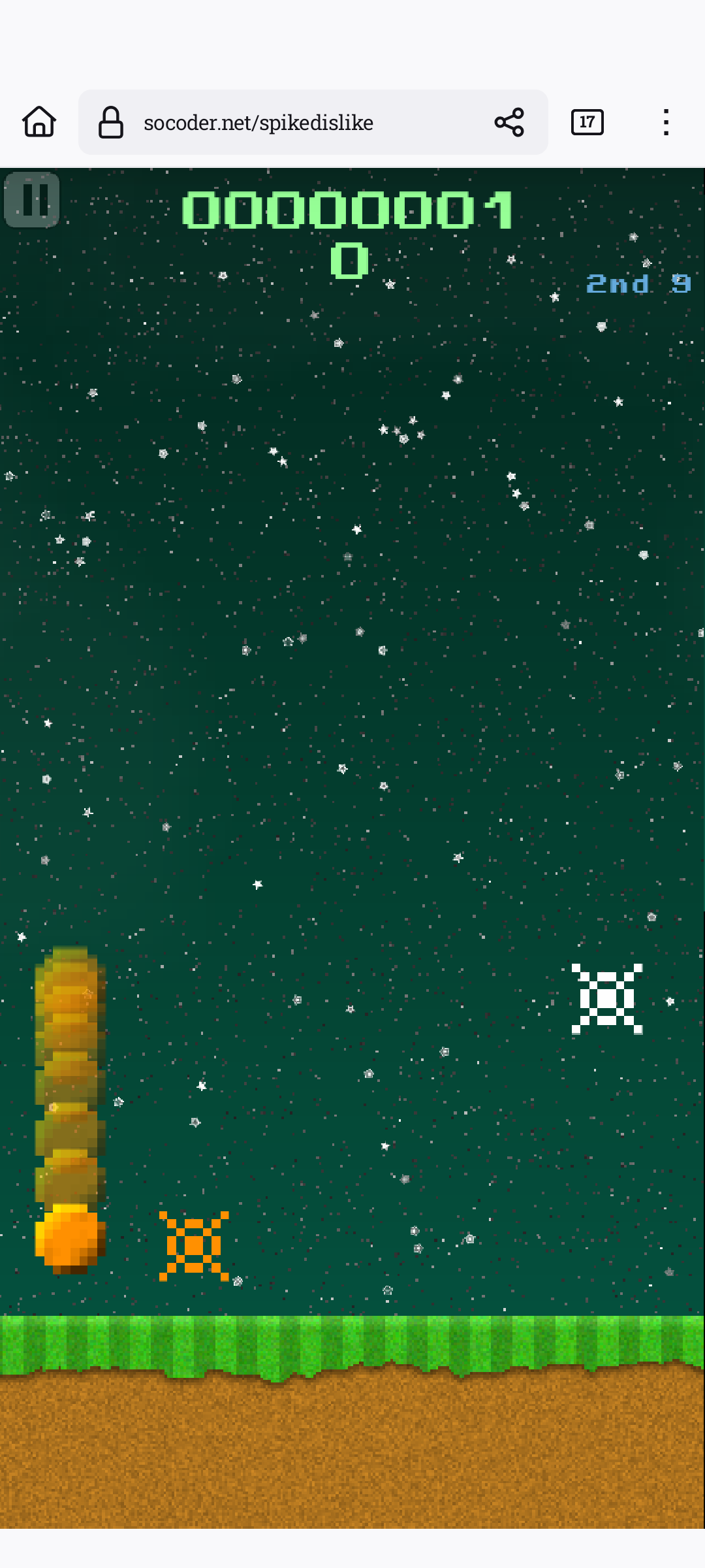
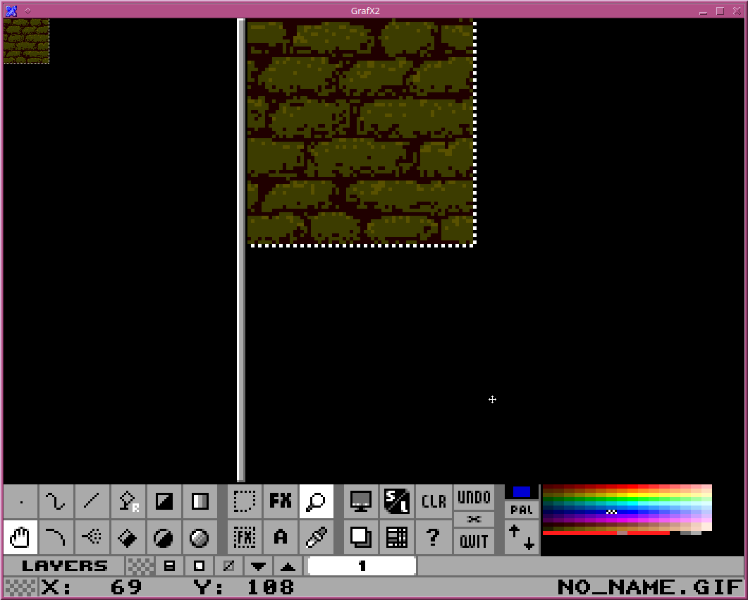
I've recently found that mismatching lumpy pixelly sprites with a neater background can occasionally make for a nice artstyle. It's something I've used half-a-dozen times over the past few games, and it's really really easy to achieve. Draw things in little tiny pixel areas (8x8 pixels) resize them up to 64x64, and add a gradient. Bingo, kick-ass looking sprites. Doesn't work all the time, but when it does, it doesn't look half bad at all! QOTD : Got any quick ways to cheat a good look? -=-=- ''Load, Next List!'' |
|
|
| |||
|
| ||||