|
Socoder -> On Topic -> Windows 7 Preview |
|
| Tue, 28 Oct 2008, 14:30 | |
Stealth
|
A look at the new Windows 7:        What do you think? Source: Ars Technica -=-=- Quit posting and try Google. |
| Tue, 28 Oct 2008, 14:56 | |
Orion Pax
|
The task bar looks like it had been Linuxed! I saw someone with a screen shot of their desktop that had a linux distro with a task bar similar to something like that. I think it looks great. Put looks arent everything. When I get time I will check that site out and see if they have posted any specs or anything. Hell I havent EVEN had my hands on Vista yet. |
| Tue, 28 Oct 2008, 15:15 | |
Phoenix
|
Seems like the program I posted in the links section yesterday will be redundant in Windows 7  I like that the task bar was trimmed down. I like that the task bar was trimmed down.
|
| Tue, 28 Oct 2008, 15:55 | |
|
Jayenkai |
2nd from the bottom, looks like I now have to move my mouse up a little further between rightclick + close.. It wouldn't be Windows without tiny little things to annoy you!! Maybe the taskbar's better like that, but.. When you've 4 or 5 browser windows, or notepads, or anything like that... it'll be hard to distinguish between them all. Needs more text! Moan, moan, moan.. etc,etc,etc.. -=-=- ''Load, Next List!'' |
| Tue, 28 Oct 2008, 18:36 | |
JL235
|
I'm really torn. On the one hand my instincts tell me that this is a hoax because MS typically leave the visual changes till the end of Windows development and so far their UI changes have been pretty minor. The taskbar is also far too different and the Start Button doesn't sit well. It's the king of the tasbar not just another icon to drag about. On the other hand though the UI does look more user friendly. Thinking about it now the taskbar is really putting me off. They could implement all that using the current Vista taskbar. I don't believe this is real. Either it's a mock up or it's MacOS with a Windows stlye skin or something similar. |
| Tue, 28 Oct 2008, 18:40 | |
|
Stealth
|
 Thinking about it now the taskbar is really putting me off. They could implement all that using the current Vista taskbar. I don't believe this is real. Either it's a mock up or it's MacOS with a Windows stlye skin or something similar. Thinking about it now the taskbar is really putting me off. They could implement all that using the current Vista taskbar. I don't believe this is real. Either it's a mock up or it's MacOS with a Windows stlye skin or something similar. These photos came directly from Microsoft's conference. They are legit. Considering how different it looks, I'd say this is the final look. I don't think Microsoft would go through all of effort of this to just make a mock-up. On the talk of MacOS X. Check out this photo: 
-=-=- Quit posting and try Google. |
| Tue, 28 Oct 2008, 18:56 | |
|
JL235
|
Now that you put them side by side, Windows 7 is clearly more pretty.
|
| Tue, 28 Oct 2008, 19:07 | |
|
Stealth
|
I think Windows 7 has a 'smoother' interface, but I think MacOS X has a 'simplified' interface. If they could combine these that would be cool. But I do think it's sad that Microsoft is moving to look more like MacOS. It's not very creative on their part. -=-=- Quit posting and try Google. |
| Tue, 28 Oct 2008, 19:16 | |
|
JL235
|
I get your point, but I really don't think they are that similar at all. A row of icons seems to be the only similarity which is far too generic to say it's copying MacOS. Even then with MacOS the whole dock is a row of icons, on Windows they are just adding some application specific icons to go next to the Start menu. The music menu one looks similar at first, but I've had Windows Media Player docked in my taskbar for years. This is just an extension of that, taking the concept further. The Windows and MacOS music menus both show a different selection of options. So what is the actual similarity? For me it just seems to be that they both have a menu accessible from the taskbar. Again that's really quite trivial. |
| Tue, 28 Oct 2008, 19:23 | |
|
Stealth
|
The big thing that stands out is that this bar acts just like the dock on OSX. When an application isn't running it will sit in the taskbar exactly like on the Mac. That seems like a straight ripoff of OSX. Plus this right click menu was taken. I'm just highly disappointed with Microsoft. They can be horrible innovators sometimes. |edit| Photo to Clarify: |edit| 
-=-=- Quit posting and try Google. |
| Wed, 29 Oct 2008, 10:05 | |
|
Orion Pax
|
Im lost. I cant tell the difference between on and off on either...how can you tell?
|
| Wed, 29 Oct 2008, 14:21 | |
|
Stealth
|
On Windows 7, you can tell it's on by the semi transparent button look around the icon. On MacOS X, there is a lit up orb right below the icon.
-=-=- Quit posting and try Google. |
| Wed, 29 Oct 2008, 14:38 | |
|
Afr0 |
This still seems too much like Vista to me. :|
|
| Wed, 29 Oct 2008, 15:44 | |
|
HoboBen |
Too much glass! Where's the features!? Windows needs a proper package manager! -=-=- blog | work | code | more code |
| Wed, 29 Oct 2008, 18:13 | |
|
JL235
|
NOOOOOOO! Package managers are too terrible on Linux. I don't want Windows saying I need to uninstall all my software in order to install Opera. Stealth, that Windows7/MacOS comparison is just silly. I don't think you can claim they have stolen the idea of using a different image for when the button is pressed so people know that it's on. This has been on machines (like drills and vacuum cleaners) for years. Now that I've thought about it more, these also just looks more like application specific quick launch buttons. I've had quick launch buttons for years on Windows. |
| Wed, 29 Oct 2008, 20:17 | |
Scherererer
|
I think it looks more like KDE than OSX...
|
| Thu, 30 Oct 2008, 07:00 | |
|
Stealth
|
Stealth, that Windows7/MacOS comparison is just silly. I don't think you can claim they have stolen the idea of using a different image for when the button is pressed so people know that it's on. This has been on machines (like drills and vacuum cleaners) for years. The only point I am making is that it is looking more and more like the Mac. The basic functionality of the dock is duplicated fairly well with this new task bar. But the whole world of me blaming someone else for copying something is hard to do. So much in this industry is copied that it is hard to say what is what. I'm not saying I hate the new task bar, because I like it a lot. I just like it for the wrong reasons, because it looks like a the Mac. Anyway, I think Microsoft is going to do much better with the new task bar. It's a good way of doing it. -=-=- Quit posting and try Google. |
| Thu, 30 Oct 2008, 07:35 | |
|
Jayenkai |
I'd still rather be able to see a bunch of named folders, rather than one little folder icon..
-=-=- ''Load, Next List!'' |
| Wed, 12 Nov 2008, 19:23 | |
|
dna |
They should have thought of doing this years ago. MS just sat and ignored Linux, and the Linux look until now. They lost market share that they will never get back. -=-=- DNA |
| Wed, 12 Nov 2008, 19:24 | |
|
dna |
If it ran with a smaller consumption of ram, then it would be really great. Many versions of Linux do not require 2-4 GIG of memory like Vista. -=-=- DNA |
| Wed, 12 Nov 2008, 19:34 | |
|
Stealth |
I've heard it runs on EEE PC's.
|
| Wed, 12 Nov 2008, 21:28 | |
|
dna |
Oh really!? What are the specs for this forthcoming OS? -=-=- DNA |
| Wed, 12 Nov 2008, 22:43 | |
|
Stealth
|
Unreleased so far. It's also in pre-beta so it's hard to tell if this will be final or not.
-=-=- Quit posting and try Google. |
| Wed, 12 Nov 2008, 22:53 | |
|
JL235
|
dna Many versions of Linux do not require 2-4 GIG of memory like Vista.That depends deeply on the distro and how it's setup. The version of X-Org that comes with Xandros on my eee used more memory then my entire Windows Server 2003 setup after booting. My home desktop also runs Vista perfectly with 1gb of ram. Vista also tries to use up as big of a proportion of your ram as possible in order to have common applications preloaded into memeory. For example on my mates 3gb machine it uses over 1gb of ram as standard. This is deliberate and a good thing because it increases the startup time (after a while they will typically start up faster then they will under XP). This is called SuperFetch. Even then speed of ram has a big factor, the ram in my desktop is approximately 300mhz which is pretty slow by todays standards. dna MS just sat and ignored Linux, and the Linux look until now.They lost market share that they will never get back. Linux also has somewhere between 0.7% and 1.3% of the PC home desktop market (0.8% is a value I've often seen). In comparison Vista is the second most popular OS in the world, second only to XP. Depending on which sources you use the Windows family of operating systems has anywhere from 93% to 97% of the desktop market. That's an error difference 4 times bigger then the entire home Linux desktop usage! I'd expect Windows 3.1 is installed and running today on more systems (namely small specialist, embedded ones) then Linux is on home desktops (and no that is not a joke). |
| Thu, 13 Nov 2008, 05:12 | |
Afr0
|
DNA - read this!
-=-=- Afr0 Games Project Dollhouse on Github - Please fork! |
| Fri, 19 Dec 2008, 14:42 | |
|
dna |
Yeah. I see. You would think that people would not want to make their machines choke. -=-=- DNA |
|
|
| |||
|
| ||||
Undock Sidebar
Log in
Register
Recent Uploads
cyangames

photo 2024 ... 4 15-30-24
spinal
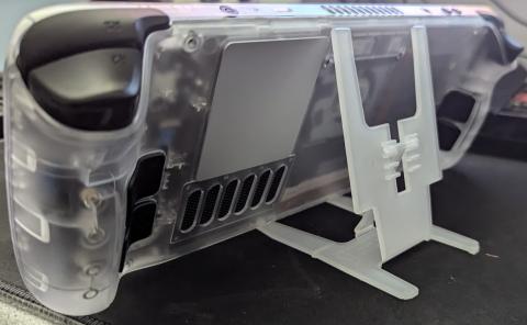
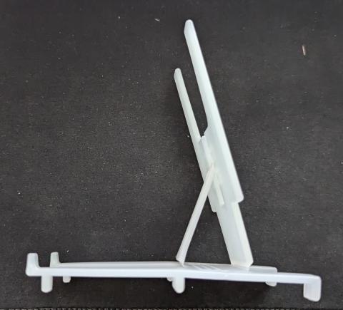
DECK STAND BACK
spinal
PXL 202409 ... W-01 COVER
spinal
PXL 202409 ... W-01 COVER
spinal
PXL 202409 ... W-01 COVER
spinal
PXL 202409 ... W-01 COVER
steve_ancell

IMG 202409 ... 212345 584
steve_ancell

IMG 202409 ... 212412 448
steve_ancell
IMG 202409 ... 212428 064
spinal
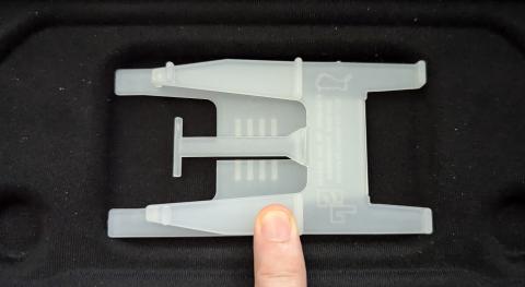
steamdeck
Log in
Register
Recent Uploads
cyangames

photo 2024 ... 4 15-30-24
spinal

DECK STAND BACK
spinal

PXL 202409 ... W-01 COVER
spinal
PXL 202409 ... W-01 COVER
spinal
PXL 202409 ... W-01 COVER
spinal

PXL 202409 ... W-01 COVER
steve_ancell
IMG 202409 ... 212345 584
steve_ancell
IMG 202409 ... 212412 448
steve_ancell

IMG 202409 ... 212428 064
spinal

steamdeck