|
Socoder -> Art and Sound -> Make a logo : Alien Deathmatch |
|
| Sat, 16 Feb 2008, 05:09 | |
|
Jayenkai |
OK, in need of some help, art wise. Current logo looks like this. Yup.. I need a better logo! So, logo challenge time! Name of the game = Alien Deathmatch, and it should probably blend in with the style of the game, see here... Although the menu does actually include lots of red in it, so you might want to keep that in mind.. Other than that, you're free to design however you wish. Aim for a 512x512 image, so it fits into the texture buffer nicely! Begin! -=-=- ''Load, Next List!'' |
| Sat, 16 Feb 2008, 14:07 | |
Phoenix
|
 Perhaps a bit too simple, but it seems to work quite well on a red background. |
| Sat, 16 Feb 2008, 21:37 | |
|
Nolan |
Phoenix: Looks neat, but perhaps a bit too hard to read? I'll take a shot at this when I get back home (Monday), provided I can find the time. -=-=- nolandc.com |
| Sun, 17 Feb 2008, 00:21 | |
power mousey
|
here is one but of a different name.  |
| Sun, 17 Feb 2008, 11:32 | |
|
shroom_monk |
I like your design Phoenix, although as Nolan says, it's a little bit difficult to read. Perhaps you could seperate the letters a little (they merge a bit), and also, simplify the link between Alien and Deathmatch. That would make it more readable. Otherwise it's pretty good. 
-=-=- A mushroom a day keeps the doctor away... Keep It Simple, Shroom! |
| Sun, 17 Feb 2008, 12:25 | |
|
Phoenix
|
Perhaps I merged the letters a bit too much. I'll change it later, when I find the lust to do so, provided that Jay is even remotely interested in it. Are you? |moan| Argh! Fix the BB code buttons for lists Jay! |moan| |moan| Argh! Fix the BB code buttons for lists Jay! |moan|
|
| Sun, 17 Feb 2008, 15:44 | |
|
Jayenkai |
Haven't really touched the game for the past couple of days. The menu's up and running, and you can now pick between any arena that are available in the /levs directory. I've not yet added any gameplay differences between levels, though, so that'll be something to play with next. I've spent WAY too much time playing with the music, trying to come up with something that feels good enough for the game. So far nothing's happening, and I have a feeling I'll be just dumping in a selection from Aminet, as usual! Still no theme tune, though. That's disappointing. I do like your logo, Phoenix. In fact, I like it exactly as it is, it's great. It doesn't really work with the menu system as it is, but I can easily change the menu so that it looks like it was always meant to be there. If you want to fix it up, feel free.. I'm not too fussed, and will gladly use it as is .. although I might take out the blood from the graphic, and animate it in instead. -=-=- ''Load, Next List!'' |
| Sun, 17 Feb 2008, 15:56 | |
|
Yo! Wazzup?
|
 Just for fun... 
-=-=- Hi everyone! I'm new to Blitz and only 10 years old so all things coding is gush to me  |
| Sun, 17 Feb 2008, 16:10 | |
|
Phoenix
|
Animated blood, eh? Sounds good But, if it's not a problem that the text is melted, it stays that way. |
| Sun, 17 Feb 2008, 16:29 | |
|
power mousey
|
I like Yo Alien logo the best. The ship and over all coloring,layout and design of the lettering. Um...the whole logo. Phoenix, the bright red in the background just clashes and hurts the eyes with your logo. Perhaps a ligher red or different color and then use blood splats of red acoss the screen. Just my opinion. |
| Mon, 18 Feb 2008, 08:15 | |
|
Hotshot |
 |
| Mon, 18 Feb 2008, 08:25 | |
|
Jayenkai |
!! Thanks, but I'm sticking with Phoenix's design. 1st release now available. -=-=- ''Load, Next List!'' |
| Mon, 18 Feb 2008, 10:55 | |
steve_ancell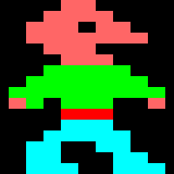
|
Jay... I think Phoenix's design looks OK and all that, but I still like your original one at the top of this topic. I has a good retro feel to it.
|
| Tue, 19 Feb 2008, 00:07 | |
|
power mousey
|
um yeah Jay, Steve does have a good point. I like your lettering and color design. It does look retro and cool too. The design and artwork is really good. I don't think you don't need another logo. Just maybe a background with perhaps a picture of an Alien and/or UFO. cheers |
|
|
| |||
|
| ||||
Undock Sidebar
Log in
Register
Recent Uploads
Socoder

com kluge ... 523-185053
Pakz

IMG 0298globe
Pakz

pickedMediakingamiga
spinal
angry dialog 01 test
spinal
angry dialog 01 test
spinal

glasses test
steve_ancell
IMG 202404 ... 104348 349
cyangames

snaphappy
Pakz
IMG 3178Spritegen
Pakz
IMG 0460Userint
Log in
Register
Recent Uploads
Socoder

com kluge ... 523-185053
Pakz

IMG 0298globe
Pakz
pickedMediakingamiga
spinal
angry dialog 01 test
spinal
angry dialog 01 test
spinal
glasses test
steve_ancell

IMG 202404 ... 104348 349
cyangames
snaphappy
Pakz
IMG 3178Spritegen
Pakz

IMG 0460Userint