|
SoCoder -> Blogs Home -> Blogs |
|
|
|
|
JL235
|
SoCoder Frontpage Designnew logo, new frontpage, new SoCoder |
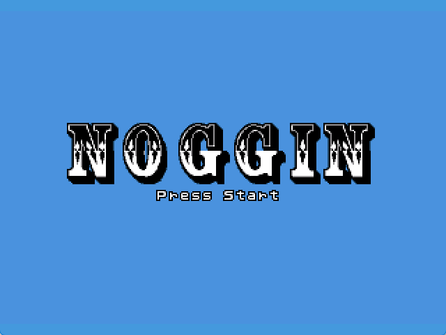
This morning I got around to doing something I've wanted to do for a few weeks. I booted up PowerPoint and built a new SoCoder design.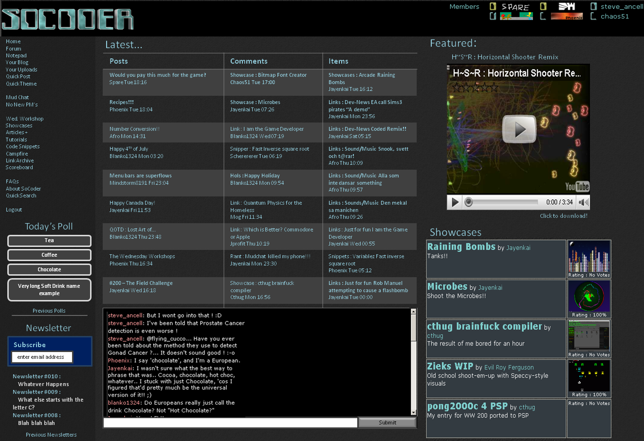 It's built with the aim to give more space to the relevant and important parts of the front page. A few points:
|
|
|
|
|
Comments |
|
| Tuesday, 07 July 2009, 08:15 | |
Jayenkai
|
1. The quote in the titlebar's a decent idea, except that my titlebar's.. That big.. Which isn't much use when it says "Socoder : Wishing a happy birthday to....." 'cos.. you know.. that's a bit big! 2. I figured that  3. Left hand side highlight would be theme dependant, that's not really too important. 4. I originally changed the "Logout" to a button because people kept asking where the logout button was! Personally, I'd love to put it back to a link, too.. Not sure how everyone else feels about that. Just seems really out of place as a button. 5. Featured showcases should be read.. Lazy people! 6. Nooooo!!!! 7. Poll above Newsletter seems better, as you'd want access to the poll more often. 8. You forgot an 8 9. Same as #2. It'd be based on theme, really, so that's not too much of an issue. It's better, but.. I really don't like that huge 3 column monstrosity that's just sitting there. I mean.. It's like.. Socoder's very very very texty, and I'm well aware that that's what puts newbies off it. That frontpage with two huge sidebars full of text. It scares people off. To fill the WHOLE of the middle with text, too! Yikes! And you're not thinking about little-res'rs again. I use a lot of PC's with 1024x768 res, both home, work, and whenever idiots break their pcs and need me to fix 'em. It's pretty much the standard, IMO. Try scaling your mega-text down, and it doesn't really work out all too well! Here's a scrunchier, more pix less txt, version. 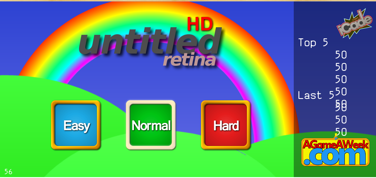 I know that Phoenix isn't a fan of the "Two menus" thing, whereby the menu is physically chopped into two different elements. I was originally thinking you could set that as an option in the theme designer, but.. The more I think about it, the more I'm considering adding it as a physical switch on the site. My Menu : Topbar | Integrated Seems like it might work. Dunno. Still WAY off doing the whole new-socoder thing, but it's getting there, slowly but surely! |
| Tuesday, 07 July 2009, 12:45 | |
Mog
|
ffs.. It's good how it is, don't fix what isn't brokennnnnnnn >:| |
| Tuesday, 07 July 2009, 14:40 | |
shroom_monk
|
I agree with Jayenkai that the giant table looks ugly, but I wouldn't mind the logout button being a link, so long as it's obvious where it is. If it was in the current location as a piece of text, it wouldn't be easy to find, but if you had, say under the logo or just above the menu, something like You are logged in as name, click here to logout. or something similar, that would make it more obvious. Of course, the advantage of having a large pictorial button is that it's big, so it's easy to find and click on. |
| Tuesday, 07 July 2009, 14:55 | |
|
Jayenkai
|
"It's good how it is, don't fix what isn't brokennnnnnnn" And that's the other viewpoint.. To be honest, I keep heading into the script and changing it piece by piece. Most of you have probably noticed those little tweaks as I go. Then, whenever I get to the whole "New theme, new style, new whole", I find myself wondering whether it's all worth it. Easier, plentiful themes should still be the end target, however I end up doing it. That's the most important thing, 'cos theme designs are few and far between. Speaking of which, I've still gotta head through all those themes and change the logo on them! I'll keep a BlitzCoder-esque logo'd theme seperate, for those who need it. Mmm...  Nice, in wood! (from AGameAWeek.com) Oh, which reminds me, I'll upload the logo's large form layered image thingy in a bit, so's you can all have a fiddle with it, and make your own little different coloured versions. |
|
|
| |||
|
| ||||