

|
SoCoder -> Blogs Home -> Blogs |
|
|
|
|
Cower
|
Poetry Portfolio Stuff |
|
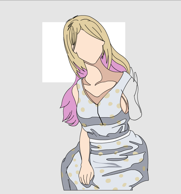
The fall 2010 semester is ending soon, and with it will come a number of things I'm obligated to do in order to pass classes. Some I've already been given the go-ahead for, others I'm somewhat in the dark on. My poetry portfolio is one of the latter things, where I'm not actually clear on what's required. However, rather than sit around and wait 'til the last minute and put together a crummy portfolio, I've been working on revising my poems and working on the cover art/layout/etc. for the portfolio. I won't be sharing any of the poetry in here since it's not done (not sure if I'll share it afterward either, but that's just because I haven't decided), but I will talk about the cover art a bit. At first, it was just something I was going to put on the cover. A big eye. Big-ish, anyway. Looked like this:  Was kind of neat, but not really there. The black-and-white will go on the title page or something, I haven't decided yet how that'll go. So, I started doing the colors, because for some reason I started with a black-and-white image (I don't normally do this):  Still not very pretty thanks to the eyeball, but for the most part the flesh has sort of stuck. The problem is that when making a cover, it has to be a 300dpi image at about 7.5"x7.5" (originally I was going for something of a portrait layout, but finally settled on using a square since I needed the increased width, but not necessarily height), which means you need more than that tiny little eye (I know, it's the size of your screen, that's tiny when printing at 300dpi), so I added some more things over time. I won't go into the various in-between stages for the various pieces, so I'll just skip to the current:  I'm pretty happy with it right now. Followed Diablos's advice and moved the face down a bit to make room for the title text, which proved to be pretty useful because I needed the extra line of space. Anyway, still a work in progress, but I've given myself plenty of time for this one, as it's due in early-ish December. |
|
|
|
|
Comments |
|
| Wednesday, 10 November 2010, 06:39 | |
steve_ancell
|
Cool!. Your getting pretty damn good at this artwork stuff Noel. Liking the zits, or are those boils?  |edit| LOL... It looks like the nose was stolen from Micheal Jackson! |edit| |
| Wednesday, 10 November 2010, 06:43 | |
Jayenkai
|
I thought the very same thing. It's like his face finally melted! *sigh* If only i could draw!! |
| Wednesday, 10 November 2010, 07:45 | |
HoboBen
|
It's disgusting. I love it!
|
| Thursday, 11 November 2010, 08:13 | |
Mog
|
Noel, you disgust me, and i love it.
|
|
|
| |||||
|
| ||||||