
|
Socoder -> On Topic -> Socoder Logo |
|
| Mon, 06 Apr 2009, 09:52 | |
|
Jayenkai |
With the whole New Theme thing gradually Coming Soon, it's probably about time we settled on a single nice neat logo. So.... Bring 'em on!! -=-=- ''Load, Next List!'' |
| Mon, 06 Apr 2009, 09:57 | |
|
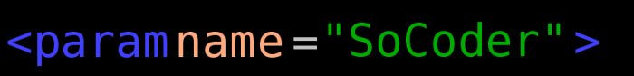
CodersRule |
Well you've already seen mine, but... Or, for uppercase C: 
|
| Mon, 06 Apr 2009, 10:06 | |
|
Hotshot |
I like the bottom picture
|
| Mon, 06 Apr 2009, 10:52 | |
Phoenix
|
A logo shouldn't be dependant on special effects, even though it can overall benefit from them. Optimally, a logo should be displayable in monochrome and people should still know that it's SoCoder. But nowadays it's hard to make a distinct logo. Oh, and I didn't think that there was a new theme coming up, since there were so few suggestions and no unanimous agreement last time. What theme are we switching to? |
| Mon, 06 Apr 2009, 11:30 | |
Scherererer
|

-=-=- YouTube Twitter Computer Science Series: Logic (pt1) (part 2) (part 3) 2's Complement Mathematics: Basic Differential Calculus |
| Mon, 06 Apr 2009, 12:50 | |
|
spinal |
 |edit| dammit... that's what I get for naming it the same  |edit| |edit|
-=-=- Check out my excellent homepage! |
| Mon, 06 Apr 2009, 13:44 | |
Phoenix
|
|edit| No longer relevant... |edit|
|
| Mon, 06 Apr 2009, 14:50 | |
|
Jayenkai |
I like the look of Instincts, other than the weird Microscope-esque letter d!! Actual theme work hasn't started yet, but plenty of core work's being done behind the scenes, whenever I get a chance. You'll just have to be patient! -=-=- ''Load, Next List!'' |
Missing ContentThis used to be a large post by Tikihead but the content has been deleted. |
|
| Mon, 06 Apr 2009, 18:32 | |
|
Stealth |
Submission Retracted
|
| Mon, 06 Apr 2009, 18:50 | |
JL235
|
I like Stealths.
|
| Mon, 06 Apr 2009, 21:42 | |
|
blanko1324 |
It's nice, but it's professional looking, and I don't think it quite represents our community.
-=-=- My Twitter |
| Tue, 07 Apr 2009, 05:39 | |
JL235
|
I think a professional look is what this site needs.
|
| Tue, 07 Apr 2009, 05:42 | |
|
Jayenkai |
This site isn't professional. This is the "Not very professional, bobbing around, having a bit of a laugh, and enjoying the fun of making games" world of coding. GameDev, and those sort are the professional world of coding. -=-=- ''Load, Next List!'' |
| Thu, 09 Apr 2009, 02:58 | |
|
JL235
|
Stealth: you come up with really nice graphics and designs, it'd be nice if you actually made a SoCoder theme which used them! At the very least if your interested in redesigning SoCoder then could you come up with a mock (and working) SoCoder site that we could look at (the actual content doesn't need to be correct, it can just be a working prototype). With an actual, working new SoCoder theme/site it'd be easier to push it onto Jay. |
| Thu, 09 Apr 2009, 10:05 | |
Afr0
|
 At the very least if your interested in redesigning SoCoder then could you come up with a mock (and working) SoCoder site that we could look at (the actual content doesn't need to be correct, it can just be a working prototype). With an actual, working new SoCoder theme/site it'd be easier to push it onto Jay.  He's already made a theme, but it was too 'advanced' for Jay to bother implementing it. -=-=- Afr0 Games Project Dollhouse on Github - Please fork! |
| Thu, 09 Apr 2009, 11:02 | |
|
Jayenkai |
No, that was the sillyness of the script thing. The theme itself is simple to implement when you leave behind the script stuff. It's just a batch of images. As a logo, in part of a singled out "pro" theme, it'd do well.. But I'm looking for an all-round logo, that would look good for all the themes.. May it be a shitty theme, or a really good one. -=-=- ''Load, Next List!'' |
| Thu, 09 Apr 2009, 11:31 | |
|
Phoenix
|
What we need is a symbol. I know that the image below in itself isn't ultra-awesome, but it's a symbol; one which can be adapted to five megazillion different themes (I am, of course, talking about the semi-circle 'S'). |edit| Note that I'm not saying that we necessarily should use this exact symbol, just something. |edit| |
| Thu, 09 Apr 2009, 13:31 | |
|
CodersRule |
The blueprint theme could have the half-circles be protractors XD
|
| Thu, 09 Apr 2009, 13:54 | |
Stealth
|
Stealth: you come up with really nice graphics and designs, it'd be nice if you actually made a SoCoder theme which used them! I was already wanting to do that. Jay told me just a design is all he wanted so I stopped there. This site could use a new XHTML + CSS foundation, but Jay doesn't want me to do that part of the system. I've tried many times coding a theme using the theme system we have now (see this design). It's just really difficult to do. I spent 5+ hours working on the design just trying to manipulate the CSS to do what I want. I ended up ditching the effort in frustration. A new site foundation would be great (I think Jay has one in the works), and I would be willing to code one for my new theme I suggested, but Jay has told me it's not needed/desired. -=-=- Quit posting and try Google. |
| Thu, 09 Apr 2009, 19:52 | |
|
JL235
|
Stealth I was already wanting to do that. Jay told me just a design is all he wanted so I stopped there. This site could use a new XHTML + CSS foundation, but Jay doesn't want me to do that part of the system.But that's partly my point, it didn't get built. Why not build an example site anyway and then show it off. Jay is very much in favour of a community driven forum, so if we can get lots of support behind it then we can get him to use it. |
| Thu, 09 Apr 2009, 20:30 | |
|
Stealth |
@DD I'll try and find some time to do that. |
| Mon, 13 Apr 2009, 10:17 | |
shockwave
|
I love Stealths design. Simple, professional and it would encourage me to want to read the content.
-=-=- https://www.dbfinteractive.com |
| Tue, 21 Apr 2009, 16:43 | |
Pio
|
Ugly but fun: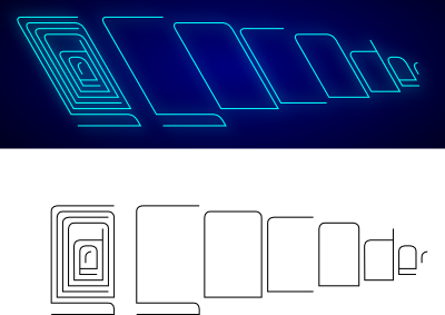 Maybe without additional letters, but animated, as a neon sign, showing one letter at the time, then flashing all twice 
|
| Wed, 22 Apr 2009, 13:12 | |
|
shroom_monk |
Hmm... I don't really like the font there, but the neon-blue colour is quite nice... but yeah, I'm not sure about the font. The 'S' seems a really weird shape, just to allow them to slot together.
-=-=- A mushroom a day keeps the doctor away... Keep It Simple, Shroom! |
|
|
| |||
|
| ||||