|
Socoder -> Web Development -> Pop! Poppety-pop! |
|
| Tue, 15 Mar 2011, 05:59 | |
Afr0
|
I've come up with a website design that works, in HTML and CSS.   This just works. There is enough space, and nothing is out of order. But it looks really quite boring and bland. I feel like I need something to make the design pop. Should I put up a flash animation of dancing squirrels on meth? I just feel like I need something to make the design stand out :\ -=-=- Afr0 Games Project Dollhouse on Github - Please fork! |
| Tue, 15 Mar 2011, 06:26 | |
Jayenkai
|
18 sidebars!!!!! 
|
| Tue, 15 Mar 2011, 06:50 | |
JL235
|
Here are my initial thoughts...
Even if you don't have real content, use appropriate placeholders rather then 'test'. Until you know what each page will display and what messages it should give then you can't really come up with a design. Designs are there to display the content in the most appropriate way possible. Note not best looking or amazing, but more appropriate. For example Blizzards site looks really ultra-cool, but wouldn't fit for a funeral parlor and all their whitespace isn't practical for lots of utility sites (like a bug-tracker). Also good designs dont 'pop', they just work. They are intuitive, feel good, are able to grab you by the balls or are just simply nice to look at. |
| Tue, 15 Mar 2011, 08:39 | |
|
Afr0
|
The orange was changed to blue, because the client liked it better. The test images are what I think will be the approximate size of the magasine's frontpages. 'Boligmagasinet' is, as the name suggests, a magazine, and you're supposed to be able to download the issues in *.pdf form. Also, I'm not sure how to make it wider. I think it is just that the monitors at work are waayy too damn wide. -=-=- Afr0 Games Project Dollhouse on Github - Please fork! |
| Tue, 15 Mar 2011, 14:14 | |
dizi
|
Spinal asked me to pop in so hi Afr0  If this is just to show the magazine covers for download then:
I work better visually so here is what I mean: 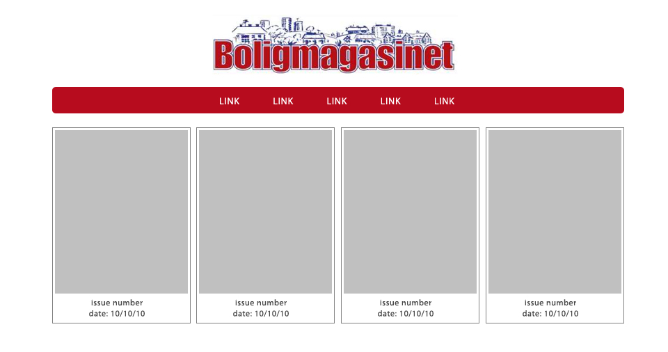 The above example is just a quick 2 minute sketch to show my points, and isn't meant as a you should design your site this way. As JL235 has said you should always design for the content and the type of site rather than just trying to make something that looks cool  |
| Wed, 16 Mar 2011, 03:27 | |
|
Afr0
|
Thanks! Looks much better now!  Only problem is I couldn't figure out how to do it with lists and CSS so I ended up using tables. ^^, -=-=- Afr0 Games Project Dollhouse on Github - Please fork! |
| Wed, 16 Mar 2011, 03:32 | |
|
Jayenkai |
This is a job, you Absolutely MUST do it properly.
-=-=- ''Load, Next List!'' |
| Wed, 16 Mar 2011, 03:37 | |
|
JL235
|
Previous issues can be categorized in a table, list or other type of layout but the current issue is different. The current issue is the most important item on the page, so I'd advise laying it out differently to help express this. i.e. bigger image and in it's own block above the back-issues with details next to it about what is in the current issue. Finally wrap _all_ content within a div inside the body (I usually call this the 'wrap'), give it a fixed width in pixels and then set the margin to '0 auto'. That will center it (although there are lots of other ways to center by CSS). |
| Wed, 16 Mar 2011, 10:27 | |
|
Afr0
|
 This is a job, you Absolutely MUST do it properly. This is a job, you Absolutely MUST do it properly. As long as the site displays well in all browsers including but not limited to Netscape and IE6, that's a job well done as far as I'm concerned. Chances are that this site won't be actively developed after I've left, so if someone comes in later who doesn't like tables, that's not really my concern. Especially because the guys running the company are focused on just that, so if another webdeveloper comes in later and claims I've done a horrible job, they'll have a hard time proving it (so long as they site looks good and does what it's supposed to). -=-=- Afr0 Games Project Dollhouse on Github - Please fork! |
| Wed, 16 Mar 2011, 17:51 | |
|
oscar |
"This is a job, you Absolutely MUST do it properly. As long as the site displays well in all browsers including but not limited to Netscape and IE6, that's a job well done as far as I'm concerned. Chances are that this site won't be actively developed after I've left, so if someone comes in later who doesn't like tables, that's not really my concern. Especially because the guys running the company are focused on just that, so if another webdeveloper comes in later and claims I've done a horrible job, they'll have a hard time proving it (so long as they site looks good and does what it's supposed to)." |edit| (I couldn't figure out how to quote properly) |edit| I sort of agree with you Afr0. As long as it works it is a job well done. But I think it's more helping to devlop skills and stay up with the latest trends that makes me do things the 'right' way. Otherwise I'd still be using blinking text tags and websafe colours. |
| Wed, 16 Mar 2011, 18:58 | |
|
JL235
|
Unless you expect lots of IE 6 users to be using the site, I would advise against supporting it (and that includes IE 7 too). Adding IE 6 & 7 support can in some cases double your workload, for what is often just a single percentage of users. |
|
|
| |||
|
| ||||