|
Socoder -> Off Topic -> Theme stuff... |
|
| Thu, 17 May 2007, 08:28 | |
|
Jayenkai |
The other day I added 2 new themes.. "Needs More Color", a greyscale theme, which was ok, but was a little colourless... To fix this, I made "Argh! Red!", a ludicrously red theme. Then I started using the ludicrously red theme, and now I kinda like it. So, today I've added an "All Red" forum-icons set, to go with it. And if that's not enough and you need even more red, might I also suggest using the SoCubic Gardenbar. I also added B3DMan's Red Squares smilies, but they don't go brilliantly with the theme, so I tweaked them a little and added a v2 underneath them. Hopefully you all like the red theme as much as I do! -=-=- ''Load, Next List!'' |
| Thu, 17 May 2007, 08:52 | |
|
Jayenkai |
I've just changed the default theme to the new red theme. If any of your settings changed, then you're still using the defaults! You'll be able to fix it by going into the Site Themes page and changing them back again!
-=-=- ''Load, Next List!'' |
| Thu, 17 May 2007, 09:12 | |
flying_cucco
|
Blood!
|
| Thu, 17 May 2007, 09:19 | |
JL235
|
Wow, Ruby Red. The topics on the side are a little harder to tell if their bold or not. The underlining start to bleed through to cut your eyes. I think you should remove them. But I like the little cubes and stuff at the bottom of peoples posts. Also, can you split the forum section panels, and the active icons at the top apart. I wanna mix and match. |
| Thu, 17 May 2007, 09:27 | |
|
Jayenkai |
"active icons"? You mean the latest posts right-bar icons? Yeah, sure I'll sort something out for them. I've finally decided to do some including for all my script, so instead of one whopping great big 230kb file uploading, I can upload little bits, and keep tweaking things here and there. So, whilst I'm cutting up chunks, I'll go about seperating all that, and make up a whole new CSSBuildSet to go with the new tweaks. This should take a few hours, but will probably take me a couple of days, fiddling with bits and bats, and generally tweaking the life out of the site!  |edit| And I don't know why the Bold isn't showing up very well! Maybe bold doesn't like red! |edit| -=-=- ''Load, Next List!'' |
| Thu, 17 May 2007, 09:46 | |
|
JL235
|
No, I mean the icon next to people's name to say how active they are. It's tied in with the forum section panels, so if I can't have cubes and the classic panels. I also think removing the underlines in the Ruby Red one, for the topics on the right, will make the contrast between bold and non-bold stand out. |
| Thu, 17 May 2007, 09:49 | |
|
Jayenkai |
Okeydoke.. Once I'm done with all the tweaking, I'll get to tweaking that.. -=-=- ''Load, Next List!'' |
| Thu, 17 May 2007, 11:22 | |
|
JL235
|
Isn't it a little suspect to have a DevCrunch theme? Maybe I should make a proper one, with the full DevCrunch banner and everything. We could then start making as close copies of real sites as possible. Like of Tesco's and Argos. |
| Thu, 17 May 2007, 12:07 | |
Eikon
|
I think the default should be something a little more pleasing to the eyes, I don't want to have to login just to read around the site. *edit* How do I go about designing a theme? n/m - I found it |
| Thu, 17 May 2007, 14:50 | |
|
Jayenkai |
I made the Devcrunch one as a joke for April Fools day, but people freaked out when it went online, so it got disabled about 5 mins later! I left it there incase anyone liked it.. But, yeah, I should probably get rid. And.. Is the red one not as eye pleasing? Sorry. Any suggestions for which is the better theme for default? Taking a look at the stats, it's BlitzCoder, then Stealth's Mostly White and third is surprisingly my Dark and Blue theme.. Everyone complained about that when I first made it! How'd that get to third place!?! Should I just shove it back to BC again? I'm not 100% sure that it's a good idea having a cloned website design for the main one! -=-=- ''Load, Next List!'' |
| Thu, 17 May 2007, 15:32 | |
|
Jayenkai |
Whooopsy! Incase anyone spotted it, apologies for the momentary freak-out, just then! I've changed back to BC for you all! -=-=- ''Load, Next List!'' |
| Thu, 17 May 2007, 15:40 | |
|
Jayenkai |
.. Actually, Eikon, if you're really wanting to do a new theme, you might want to hold off a couple of days! I'm retweaking the heck out of the css stuff! (But keeping the ability to use the older css files, too.) -=-=- ''Load, Next List!'' |
| Thu, 17 May 2007, 15:54 | |
|
Eikon
|
I think the BC theme is best for first visitors to the site, they may not register to find the other themes if the default is too wild. I'll hold off on making a theme until your work is done. |
| Thu, 17 May 2007, 16:22 | |
|
spinal |
I'm using the bc theme, I think its the best of the bunch.
-=-=- Check out my excellent homepage! |
| Thu, 17 May 2007, 17:05 | |
|
Jayenkai |
Planned so far.. (with quite a lot of these, surprisingly, in a working state!!) Any further suggestions/requests are welcome.. -=-=- ''Load, Next List!'' |
| Thu, 17 May 2007, 22:05 | |
|
Jayenkai |
5 in the morning, and starting to get tired, now! If you want to see the new CSS progress, head on over to index2.php, but be aware that it's half-assed right now, so some bits are done, and other bits are garbage! If you switch to the "Argh! Red!" theme you'll see things a little better, since that's now got a similarly half-assed default2.css file. I'm not keeping the theme like that! It's just for testing everything!! Things to spot. The Main Menu on the left now has 4 distinct sections. The Latest Posts/Items/Comments are now seperate, too. Comments will all be tweakable seperately depending on their area.. (But that ain't done yet!) And... I really need to redo MiniIndex.php, 'cos it's messing up if you let it Ajax-update the news page! I'll get some more work done when I eventually wake up! Nanite, all. -=-=- ''Load, Next List!'' |
| Fri, 18 May 2007, 08:41 | |
|
Jayenkai |
Day 2 : I've been working with 2 seperate CSS files, today. Files number one is here Ignore the top of the file, it's out of date! What's below is (i believe) a better layout than before. Starting with Basic HTML rules, moving onto Standard Site fonts, then into Layout, Main menu, Sidebars, Profiles, the Member list, the Search page, the Front page, News pages, Forum view, Workshops and then Comments. That's plenty of tweaking, right there! But it's a bit of a mess in that file, so I decided to restart the whole css file as if it's a neatly designed template. It now looks like this. (A snippet) Much neater!! And, notice how the colors and things are all Variables. Well, CSS can't quite cope with variables, so instead I've listed the variables at the top, and you can use your chosen text editor's Search+Replace features to replace all the variables. Then once it's looking neat, go back into the raw code and fiddle manually to get everything Just Right. If you'd like to see that working to a moderate degree, switch to the "Needs More Color" theme, and try it out in index2.php (although, again, it's not quite a perfect theme, since I'm still testing, tweaking and adding stuff.) The css for that version is here (Note that I have my tabs set to 4 in Programmer's Notepad!) .. But it's getting there
-=-=- ''Load, Next List!'' |
| Fri, 18 May 2007, 09:28 | |
|
JL235
|
With the 'SoCubic' icon/panel theme, the cube for people in the mud-chat has a white, rather then a clear, background.
|
| Fri, 18 May 2007, 09:31 | |
|
Jayenkai |
Does it? I just fixed that the other day! Bah, I must have uploaded the dodgy one again! I'm going to be changing their locations later, anyway, so I'll sort it out then. (So's you can pick the clocks independantly of the rest of the forum icons) -=-=- ''Load, Next List!'' |
| Fri, 25 May 2007, 17:38 | |
|
Jayenkai |
And so we return to this.. For obvious reasons I did absolutely bugger all to the Site Theme stuff, today! I'm currently (still!) uploading all the Workshop stuff. There's 300Mb worth of stuff, and I'm about 1/4 way through it all. But at least FireFTP isn't dumping the files all over the place like CoreFTPLite was! So, a retelling of the progress. Phase 1 is pretty much done.. That's going through the site script and changing all the CSS names, and also sprucing up the layout of certain areas of the site. Phase 2 is also now near enough complete. That was to create a test CSS file, make a template CSS and then build up a whole theme to work within the new parameters. Phase 3 is in the early stages. That is to reconstruct all the original themes in the new css style. That also includes having to make Forum-Panels and other things to fit in with each theme. Phase 4 is being done alongside Phase 3. A Blitz program is being made to help in the construction of themes. So far it can pick out a random colour scheme, which you can then tweak a little to make it more readable. It auto generates .css files from the template, and you can use the test.html to view them. (and, of course, go back and forth until it looks nice) I'm then planning to add extra functions to make Forum Panels and the typical buttons for around the site. Hopefully I can add a whole bunch of settings to let you tweak these into a whole range of styles.. Once it's finished it's half of the work, it'll then be your job to edit the raw CSS file, make everything 100% more wonderful, and then play about with all the images. A quick note, if you are planning on using this, get Irfanview installed on your system, since I've found a neat way to get Blitz to run all it's generated .bmp images through Irfanview, and convert them to .gif's.. (yeay!) Although I've not sorted out the Transparencies, yet! So, plenty of work to be done, and I really could've done with doing that today! Aw well.. Never mind! -=-=- ''Load, Next List!'' |
| Sat, 26 May 2007, 00:00 | |
|
Socoder |
Mr Testo says : Jay just fixed the Ajax Sidebars for the new Index2.php, but when he tried to test them he realised he couldn't tell if they worked or not, due to them looking all blended in... He couldn't actually tell the difference between "bars not loading at all" and "bars loading and working well" So Mr Testo had to pop on and make a post, and then Jay had to wait for the sidebars to update. |edit| After a little while waiting, the new sidebars seem to have loaded properly. That made Jay happy. Jay grinned from ear to ear. Maybe it was the joy of getting the sidebars working..... Or maybe he'd drunk too much coffee. |edit| |
| Sat, 26 May 2007, 07:02 | |
Blitz3Dman
|
I think the coffee did it.
|
| Mon, 28 May 2007, 01:51 | |
|
Jayenkai |
Getting there... The Button editor's pretty much done. Although there's plenty of tweaks still left to add. You can choose from a selection of premade buttons images, (or add your own, or use one of the included render modes, or even add your own render mode since it's all source-included!) and then it plonks the text over the top. Nice and easy. Change the width and height of buttons. Set the Width slider over to the left, and the buttons come out the size of the original button image. Set it to the right and it changes the buttons depending on the font width/height. Everything inbetween lets you pick your own sizes. You can pick the size of font used (font select is coming soon.. Just need to figure out a neat way to do it!) Render modes currently included are "Random Dots" and "Diagonal Sine Wave" But you can get plenty of variety out of even those 2 options. (Plus of course, pre-rendered image!) And, of course, it lets you decide whether it should render with TFormFilter activated. Phew... Next up, Panel rendering! -=-=- ''Load, Next List!'' |
| Sun, 03 Jun 2007, 16:36 | |
|
Jayenkai |
Spent most of this week doing.. pretty much nothing, to be honest! Still, back to work we go... I haven't gotten to Panel rendering, since I decided to tweak the buttons a little more. I added a simple "Rounded Bubble Button" renderer, along with more color options for the buttons. The bubble buttons could probably do with a little bit more work, but they're ok for now. I've just finished off making a HUGE Test theme page. I'll probably make each section switchable, since at the minute it's just one long page of stuff! I'm getting close to the release. I think! Although... I do still have to rebuild all the themes. *Screams* -=-=- ''Load, Next List!'' |
| Sun, 03 Jun 2007, 20:03 | |
|
HoboBen |
LOL, well, if you want a hand, give a shout  Only, I have exams next week. But even so, pffft, English is a doddle.
-=-=- blog | work | code | more code |
| Sun, 03 Jun 2007, 20:20 | |
|
garand |
On the subject of websites and themes... ~ ! TOPIC HIJACK ! ~ Visit Krypton Media in FireFox and Internet Explorer and tell me what you think of my new layout. Criticism wanted! ~ ! END OF TOPIC HIJACK ! ~ |
|
|
| |||
|
| ||||
Undock Sidebar
Log in
Register
Recent Uploads
Pakz

pickedMediakingamiga
spinal
angry dialog 01 test
spinal
angry dialog 01 test
spinal

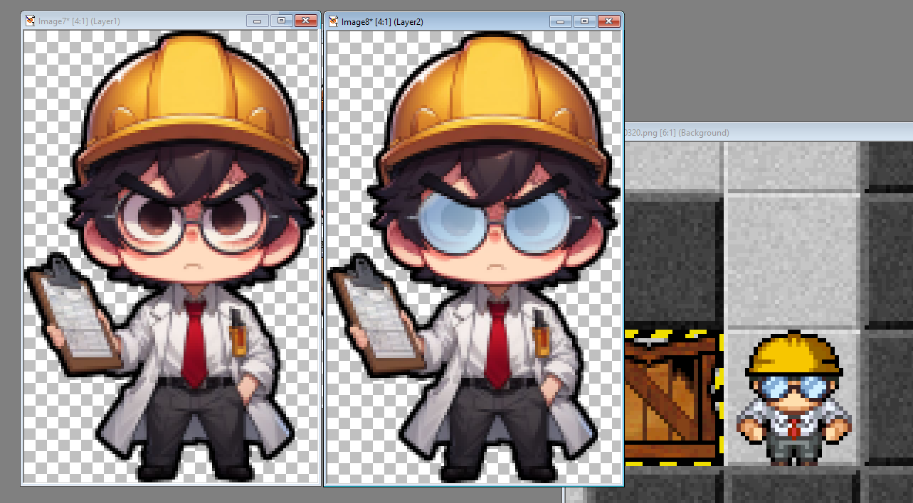
glasses test
steve_ancell
IMG 202404 ... 104348 349
cyangames

snaphappy
Pakz
IMG 3178Spritegen
Pakz
IMG 0460Userint
spinal
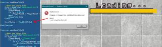
nerdly error 1
spinal
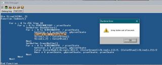
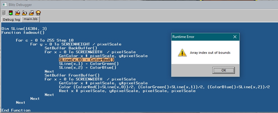
blitz3d error array
Log in
Register
Recent Uploads
Pakz
pickedMediakingamiga
spinal
angry dialog 01 test
spinal
angry dialog 01 test
spinal
glasses test
steve_ancell

IMG 202404 ... 104348 349
cyangames
snaphappy
Pakz
IMG 3178Spritegen
Pakz

IMG 0460Userint
spinal

nerdly error 1
spinal
blitz3d error array