

|
Socoder -> Off Topic -> iOS7 Thoughts |
|
| Mon, 12 Aug 2013, 06:49 | |
9572AD
|
I’ve never used iOS. Last time I used a Mac it actually was a Mac. Somewhere around 1993.
-=-=- All the raw, animal magnetism of a rutabaga. |
| Mon, 12 Aug 2013, 06:49 | |
|
Jayenkai |
As "Nice" and "Shiny" and "Mmmmm" as iOS7 is, I can't help but get the feeling that it's not quite right.. Using it, you kinda get the feeling that it was designed by a designer, not by a user. Things are indeed lovely, and they do look great, but.. They don't look like they belong on a phone. Things like the buttons having no definable "button" features. Sure, that makes for a lovely screenshot, but.. You kinda need a button!!! When you have a white screen with a blue font, and some of the blue bits are clickable, but other blue bits aren't. There's not a heck of a lot of discernible differences between the two. You can't always tell what bits are supposed to be tappable, and which aren't. And that stupidy thin font. Obviously they've designed this on great big monitors, and not considered how fucking unreadable things are when scaled down to a little tiny fucking screen. The iPhone Retina display might be good, but FUCK, it's not THAT good!!! A case of Designer vs User, IMO. -=-=- ''Load, Next List!'' |
| Thu, 15 Aug 2013, 01:21 | |
JL235
|
A revamp is really needed though to keep iOS feel up to date. Even though it's still one of the best (or the best) mobile operating systems, the fact that it hasn't visually changed in years, makes it feel old. For example one reason why people like Windows Phone, is simply because it looks different. |
| Thu, 15 Aug 2013, 02:41 | |
|
Jayenkai |
I don't mind change. I'm not "one of those".. What I do mind, though, is the removal of "obviousness", and that's something that iOS7 seems to be good at. Prime example.. 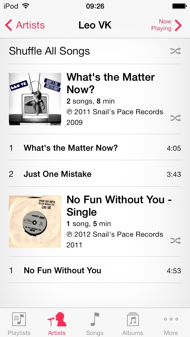 The music app. Far be it from me to suggest that this is one of the MOST important aspects of something like, say, an iPod, but to me this little lack of "obviousness" is really fucking frustrating. Let's say you want to play the single "No Fun Without You". Where do you tap? I'll give you a clue, it's not the album picture. That doesn't do anything. Neither does that entire section, except for the teensy little shuffle icon in the corner, that works.. Also the per-track listing is clickable, even though it appears to be no more clickable that the rest of it. To me, glancing at it, the clickable bit should be THE BLOODY GREAT BIG PICTURE, and not the smaller bit of text underneath it. And glancing is the important bit, here. This is a phone, or iPod. You grab it, click it, and put it away. It should be bleeding obvious what everything does, and where you should be hitting it. You should have to grab it, hit the Music button, then go "ok, now what" and have to wait a couple of secs for your head to figure out what you oughta be doing next. .. It might be just a couple of secs, but in the world of mobile, every second counts!! -=-=- ''Load, Next List!'' |
| Thu, 15 Aug 2013, 10:44 | |
|
spinal |
Putting off re-upgrading, as it means also upgrading xcode and in turn upgrading os x, which will cost me money 
-=-=- Check out my excellent homepage! |
|
|
| |||
|
| ||||